Federal Officials Unveil Streamlined Marketplace Website
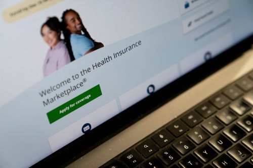
Consumers using the federal healthcare.gov website when open enrollment begins next month should expect a faster website with a shorter application form and features making it easier to use on mobile devices, Obama administration officials said Wednesday.

In a briefing with reporters, they showed off a live version of the updated site and said it has already been used to enroll about 20,000 people.
Still, they did not promise that the website will be glitch-free when it opens for purchases on Nov. 15.
Nonetheless, the administration is focused on “everyone having a good consumer experience,” said Andrew Slavitt, the principal deputy administrator at the Centers for Medicare & Medicaid Services.
Last year, the website’s debut was disastrous: Consumers could not start or complete their applications and faced almost daily website crashes. Problems lasted for months before experts were able to stabilize the system. Eventually, more than 7 million people enrolled and paid premiums on their policies.
This year, the administration officials said they have spent far more time — five and half weeks — testing the revamped website, rather than the 10 days they tested it before last year’s launch. The most intense testing began this week and officials said full “load testing” — determining how many consumers the site can handle at one time — won’t begin in earnest until late October.
Slavitt would not release specific numbers, but said the website aims “to handle significantly more [consumers] than the highest peak day last year.”
That could be particularly important because the time period for enrollment is shorter this year. In addition to new enrollees, many of the people who signed up for this year will be reviewing their options and re-enrolling. They – along with new customers — who want coverage to begin Jan. 1 have only a month – from Nov. 15 to Dec. 15 to select a plan. So a lot of activity is expected during the initial weeks.
After that, customers who enroll by Jan. 15 will get coverage Feb. 1, while those who wait until Feb. 15, when the enrollment period ends, will have coverage that begins March 1.
Since July, about 20,000 people have enrolled using the revamped website, all of whom were able to shop outside the official 2014 open enrollment period because they faced a special life circumstance, like the loss of a job or a divorce.
Changes for this year include:
— A shorter application form for new enrollees — 16 screen pages, down from 76. Officials said an estimated 70 percent of new enrollees will be able to use the shorter form. Others, with more complicated situations, will have to enter more information.
— There will be a “back button” that allows consumers to flip back to an earlier page if they need to correct information they’ve already entered, without having to start the entire application over, as was the case last year.
— Information will be sent through the “hub” of the system for verification in one batch, at the end of the application process, instead of question by question, which officials said should speed the process.
— The website is “optimized” for use on mobile devices, which last year were used by about 20 percent of applicants, said Kevin Counihan, chief executive officer of the website. That could make it easier to reach some target consumers, such as young people and Latinos, more than 74 percent of whom have smart phones, he said.
Still, some things consumers want — such as easier access to the lists of doctors and hospitals that make up insurers’ networks of providers — won’t be included on this year’s revamp.
And those who want to start shopping in advance by comparing prices for coverage will have to wait until about Nov. 9, officials said.


